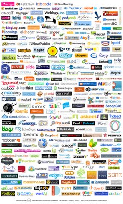
Web 2.0 logos
Tuesday, July 25, 2006
 I'm a huge fan of logos. Especially web 2.0 logos. They're simple, colorful, catchy, modern-looking, and usually have a glass-y finish to them. Here's a good description.
posted by Michael Tavani @ 2:28 PM |
![]()